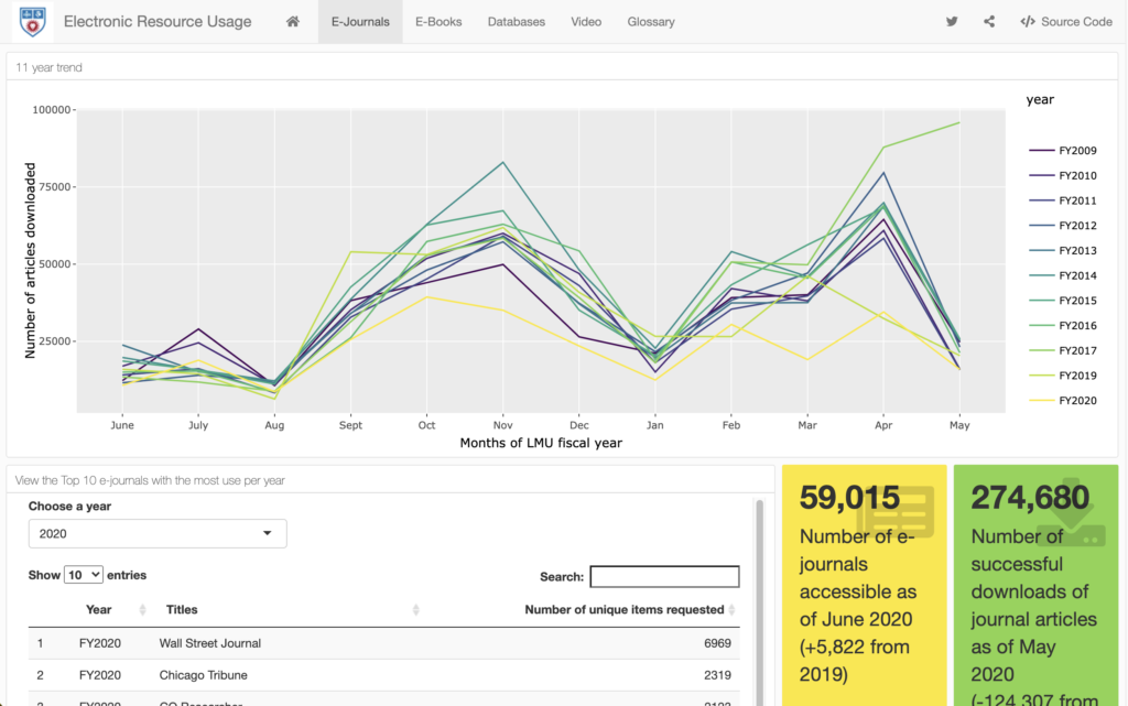
New usage statistics dashboard alert! Check it out at https://whheresourceusage.shinyapps.io/dash/. Drop me a line here or on twitter and let me know how much you love it.
***
For the last several years I have been annually publishing the usage statistics of our library’s licensed e-resources, using a Google Sites dashboard that my colleague @mars_bar85 designed. We started developing the dashboard in summer 2013, after constructing a brief document about our decisions and goals for the dashboard. The resulting dashboard still looks good after all these years: https://library.sites.google.com/site/eresstatistics/home.
Over this past year I’ve been learning R (mainly just for fun) and have grown really interested in the coding behind summary visualizations of data. I wanted to put into practice what I was learning so I decided to update the e-resources usage statistics dashboard to include interactive elements, and this time build it in R. I used a flexdashboard with some shiny components, and it is housed (a free account) at https://whheresourceusage.shinyapps.io/dash/. The components I’ve programmed in the dashboard allow for user interaction and more dynamism than our old dashboard. It’s time for this change. The most exciting component of the new dashboard is an interactive table of all of our licensed databases and their usage statistics. The users of the dashboard can now search on demand to see the usage of any database they’re interested in, rather than emailing me to ask for those stats. Users can sort alphabetically or by usage, to see our most-used/least-used databases, and can download the data for offline manipulation.
This new dashboard still adheres to our original goals of wanting “to communicate … simply, clearly, and quickly about electronic resource usage,” and now it does it in a more engaging way.
Any feedback on the new dashboard is welcome, I’m still learning! The source code is available on the site -> https://whheresourceusage.shinyapps.io/dash/


