…is that you’re gonna get an answer!
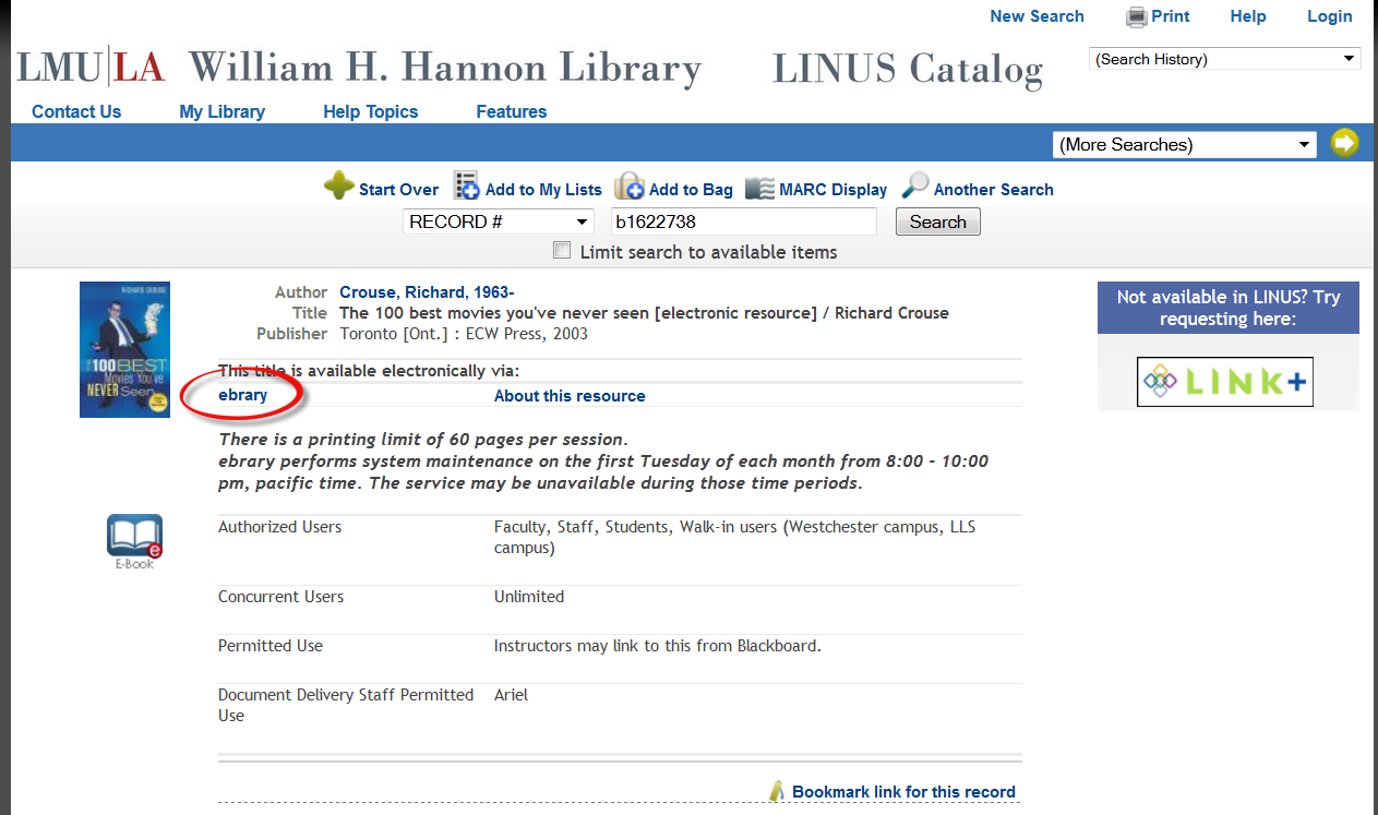
Librarians who serve our patrons at service points are THE people to stay in touch with if you’re thinking about how to improve your library’s electronic resources. I stopped by the Info Desk to chat with the librarian there today and she mentioned what a drag it was to have the link one clicks on to get to an e-book look so nondescript. People never know where to click. Look at the image I’ve put here. Why would anyone ever think that clicking on “ebrary” would take them to the e-book? It’s ridiculous. It’s also already on the list of things to discuss library-wide, to come to some consensus about how it should look, and what the link should say. I reminded the librarian that this was definitely on the list of things to correct.
Then I asked, “What else ya’ got?” And guess what? The librarian had more ideas about what to change, how things might work better for our patrons. How awesome is that? My take-home of the day is to keep asking that question.


