
Last year I was lucky enough to take a one-day class with Edward Tufte, about presenting data and information. The course itself was wonderful and I got to chat with him for a little bit about challenges in presenting social network data. He signed copies for me of his books that came with the course. All in all, it was a visually inspiring day. In the class I learned about using sparklines (in Microsoft Excel) to show data trends. Within one cell on an Excel spreadsheet one can insert a mini graph that summarizes multiple cells of data.
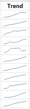
I took the idea home and decided to track the costs of the library’s e-journal publisher packages over the years, to look at how it has changed. I’ll paste here the trend visualization for some of our packages from 2009 to present. What the sparkline allows you to do in this case is to get real depressed in a quick glance! It is clear that our package costs have escalated over the years, with a rare dip and hardly any leveling off. I don’t aim to solve that problem in this blog post 🙂 but wanted to show off how a small visualization of data can help the viewer quickly understand a general trend.
I wonder if you’ve used sparklines in your own work? I’m interested to think about how to apply this with different kinds of library data.

Compare these sparklines to your library’s materials budget over the years.
That is a wonderful idea, thank you.